Our storyline could be seen as conventional as it is a group of friends that go on a camping trip and they all end up being killed, however ours has a dark meaning behind their killings and its someone seeking revenge. We decided to use typical characters to help the audience relate to them.
Although following most conventions we decided to challenge conventions by having an all girl cast which is very un-typical horror films as they normally include a mixture of male and female characters however i still think that this will appeal to our target audience. We also chose to use the antagonist as a girl as it will not be what the audience is expecting as in most horror films they use a male antagonist or a scary creature.
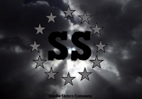
In the opening of our film trailer we included a production company logo, which we created ourselves in photoshop. We made it to look sinister and dark to fit with the horror genre, we also created in the same style as real film production company logos. We used the style of the clouded background and the starts surrounding our production company name. It is conventional of any film to include the production company logo at the beginning of any film as it makes the audience aware of who created it and also gives the audience an insight to what genre of film it is as some film production companies are associated with a particular genre. This is why we made ours dark, with an eerie feel to it so the audience will know its a horror film and it fits in with the horror genre.


When creating our trailer we included many conventions such as using freytags triangle. Our trailer starts off at a slow pace showing the girls at school then setting off on their camping trip. The pace quickens and draws the audience in, straight after is the climax where the clips are much shorter and faster, the pace of the film slows again before the conclusion. The editing of our trailer also fits in with conventions we start of with slow editing using longer clips, then when the action starts build we cut up the clips to make them shorter and even speeded up the pace of some of the clips this was to match the speed of the music to show to the audience that the action was rising to make them excited yet anxious to what it was building up to creating this tension is very conventional of horror trailers. We then added a twist, when the action had fallen and the music had stopped, after the caption 'Coming soon' we used a short clip of one of our characters being dragged of into darkness, as the music has already stopped the diegetic scream is really loud and will make the audience jump. The clip is normally memorable as it is the last thing the audience see. Although this is not conventional of freytags pyramid, it is conventional of some horror films we have researched.

Like many trailers we have used captions to help the audience underestand what is going on and the storyline and they help to build suspense. We had to cut down our captions as originally we had to many and it would make the audience loose focus so we removed some and make them shorter and more to the point. They was also not very appealing to the audience as they were red writing on a plain black background to make them more interesting we added red blood splats to make a clear link to our horror trailer and the violence it contains. We also changed the font to the same font as the title on the film poster and on the film magazine, so the audience can make a clear link between all 3 of them. To make the captions more interesting they start off small and get bigger so they appear to be coming forwards towards the screen.


For the caption of our film title, following conventions we changed the style slightly so it stood out from the other captions. And our last caption included coming soon a typical convention of teaser trailer.

The editing is a very important part of film trailers. We edited our film in typical horror trailer style by building up the tension. To create the tension and suspense we needed to edit our footage in a conventional and effective way. We started off by editing our footage for the beginning by changing it black and white to symbolise to the audience that its the past, we kept the shots quite long to help tell the story. This all changes when the girls end up the forest we cut the shots really short so they are more fast paced to help build the tension to build to the climax, we then use a couple of longer shots for the falling action. We really wanted to edit our footage to create a tense atmosphere that you get in most horror trailers.
For our trailer we mainly used non-diegetic sound we decided to use just one soundtrack called 'chainsaw horror' as we thought it fitted our trailer well and towards the end we faded it out slowly. We did try to use two different soundtracks a slow one for the beginning and a more fast paced one for the climax however we though it didn't sound very professional the cut from one to the other was too noticeable and sounded messy.
Although we didn't include any dialogue, throughout the trailer we did emphasise certain diegetic sounds such as, screams, heavy breathing and the paper ball hitting jodie's face. However through watching the trailer back and audience feed back we came to find that the screaming and heavy breathing sounds were distracting and unnecessary so we muted them from all the clips and just used the soundtrack. However the sound of the paper ball hitting jodie's face is necessary as it is an important part of our storyline so we emphasised this by repeating the shot three times each time zooming in on her face, including the sound on this clip really helps the audience understand the impact of the ball hitting her face. We also left the loud scream on the last clip at the end to really catch the audiences attention.
We followed the conventions of mise on scene which in horror films are typically isolated locations in the dark at night time, which is what people associate with horror films. So we filmed in a forest during the night although this gives us a conventional and realistic scary feel, it was also very hard to film some shots and some shots were not of the best quality as we had very limited lighting. When we uploaded the footage onto the macs some shots the lighting was very poor and made the shot very dim and hard to see so we edited some of the shots on Premier pro to lighten them to make them easier to see and much clearer. On one shot in particular we used the lighting to highlight what we wanted the audience to be focused on. We also used the lighting in conventional way from the genre film noir, chiaroscuro can affect the mood of a person by the way the light is separated and shines on the character. To create this style we used the car headlights to shine on the characters faces to show their facial expressions and emotion.

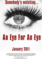
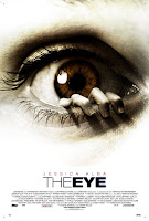
Poster - Before producing our film poster i googled many different film posters and researched 3 existing film posters in depth to understand the conventions, so that i could use some conventions in our poster to. While analysing film posters i came across the poster for the film 'The eye' this had the same look/layout that we wanted to acheive so we used this to help us to create our poster.


We didnt want a busy crowed poster we wanted to keep it simple but effective. To link with the title of the film we used an eye for the main image dominating the page, also very personal to the veiwer staring into the eye. We made sure the audience could tell that it is a females eye as we have an all girl cast. To link to our other promo pack our magazine front cover the main image used on their of the 5 girls we used in the pupil of the eye, makes the audience wonder if they are watching someone or they are being watched this also fits in with out tagline 'somebodys watching...' this also signifies to the audience that they are not sure who is watching who.
We followed the typical conventions by having the film title the largest peice of text on the page so it stands out. The release date and the small text at the bottom of the page informing us of the cast the film companies, directors and producers. Also including the website at the bottom like most typical posters. We tried to make ours in the same style of writing as The Eye film poster to make ours look as authentic as possible.
Magazine front cover - We decided to challenge conventions for our magazine front cover as by researching many film magazine front covers we noticed that only one or two people are featured on the front page however we wanted to use 5 of the main people, we came across a few film magazines that did this aswell.
We like the layout of the main image from this magazine the formation of the girls and the way they are staring straight at the audience, we used an image like this for our front cover of our main 5 characters. We followed conventions by using the main colours from our trailer captions and our poster, red white and black, these colours also help to make our magazine stand out and are commonly used in film magazines. We placed the magazine name at the centre of the top of the page and above we included a skyline. Underneath the title we included the issue number and website very conventional of film magazines. We included a pug on the left side of the page white with a red background to stand out. We placed the film title in the middle of the page in the same font we have used throughout. Text on each side of the page and a barcode in the bottom right corner.


No comments:
Post a Comment